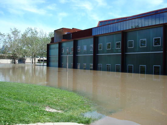
I am outraged that the University of Iowa has, for a second time, selected architect Steven Holl to design a new building on the Arts Campus. Holl was previously commissioned to design the Art Building West to replace the old art building that was heavily damaged in floods in 1993. However, Holl disregarded the primary design goal, to build above the flood plain. In fact, he built it even lower than the previous flood-damaged buildings. He could easily have built the building a few feet uphill from its present site, avoiding the flood risk, but Holl fell in love with a pond on the site, and built the building at the level of the pond, well below the level of the flood plain. And of course the building was flooded and seriously damaged during the floods of June 2008. Now Holl is commissioned to build another Art Department building adjacent to the old building, just uphill, where he should have built the first building. Here is a photo of the old building during the flood, taken from the position of the new building’s site, notice that the new site is above the flood waters.
I attended the opening of Art Building West in 2006 and met Steven Holl. I intended to produce a full review of the building’s architecture and the architect, but I was so livid at the outrageous problems with the building, I decided to wait until I cooled off before writing my scathing review. But it has been years since the opening, and now I am angrier than ever. So I will have to write my review. It will take some effort to write it clearly when I am so angry at Holl, but let me preview the most salient point.
Holl’s distinctive architectural features, his staircases, are a hazard to the occupants of the building. Before the new Art Building had even opened, one visitor was seriously injured, falling down a staircase because it did not conform to building codes. The building will continue to injure people for as long as it is in use. Fortunately, the building has not been used since the 2008 floods.
I am outraged that the University of Iowa would, once again, hire this architect to design another building. No doubt he will design another similar building, with features that are designed to please the architect, but disregard the safety of the building’s occupants.
Category: Art
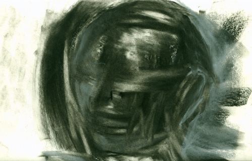
Self Portrait 1995
Sometimes when I haven’t posted anything for a while, I go dig through my archives and pull out something I haven’t seen for years. Here’s a quick self-portrait study I did in a drawing class, I think it was in 1995. This drawing is 11 by 14 inches and executed in black and white chalk, grey pastels, and lots and lots of erasure. The drawing is so soft it could easily be damaged just by wiping a finger across it, so I figured I should scan it to keep a backup.
Palisades
My favorite landscape spot is a called “The Palisades,” I go there occasionally to take photographs, it’s especially beautiful in autumn, you can view the fall colors in the forests growing over stone cliffs next to the river. Here’s a fall photo of The Palisades in my special antique photochemistry printing method.
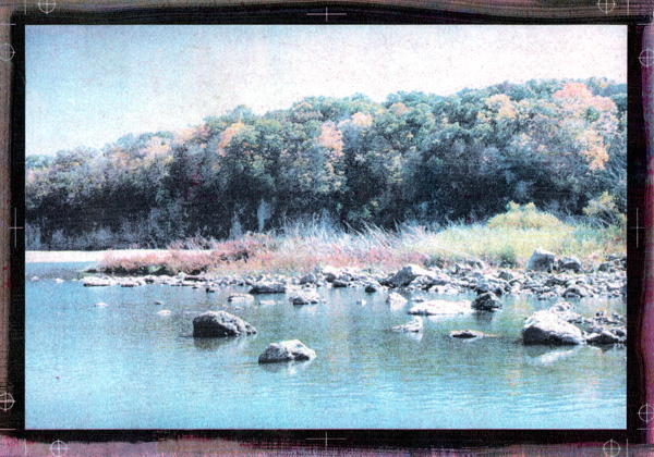
I use an antique photo printing method, it’s long been abandoned since it is very time-consuming, inaccurate and prone to failure. And this print was one of my failures. Each color of cyan, magenta, yellow, and black requires a layer of pigment emulsion, painted on the paper by hand. Each color is applied, printed, washed, and dried before the next color can be applied. Sometimes each color must be printed multiple times, I think this print has about 7 or 8 layers. This can take days.
And there’s the problem, one error in one layer can ruin days of work. Sometimes the error can’t be seen until all the layers are printed. This print had a problem with magenta, the magenta emulsion is the most difficult to get right, it’s almost always the problem. This print had a faint overall magenta stain that I couldn’t recover. It was quite a disappointment as I thought I got the color right except for that faint pinkish tint.
But today, I was going through my prints and it occurred to me, I should scan and color correct it in Photoshop and see how good the color was after removing the magenta. It won’t fix the original print, but I could see how it might have worked without that one error.
This color-corrected scan works pretty well, if I do say so myself. The printing method isn’t highly detailed, it has a scratchy, textured look that some people compare to an aquatint. Alas, most of that texture can’t be seen in this scan, only in the original print.
I like to leave the margins of these prints exposed, people always tell me how they like seeing the brushwork at the edges of the print, it shows that the work is clearly handmade. But I like seeing the registration marks, I’m proud of them. It isn’t easy to keep clear registration marks aligned through 7 or 8 layers.
Overall, the color worked well, except for the sky which was a little too pale. There’s a reddish patch in the middle which represents a patch of red shrubs, you can’t quite make out the shapes but that color is right. The green and yellow foliage in the trees have the right colors, and the grey stone wall is a proper neutral grey (it usually looks blue in the shadowed sunlight). I’m pleased with it, I didn’t pick this scene because it was such a great photo (it isn’t really) but because it would be a challenge to capture all these diverse color conditions in this inaccurate printing process. It was a good experiment, I was pleased with the results, even if it is far from perfect.
This sort of printing is known in the photo world as an “alternate process.” This process is extremely rare, very few artists still use it for color printing. I took one of my best color prints to a local gallery, prints of this type would generally sell for a minimum of $1000 to $1500, they offered to sell them for $250 with a 55% gallery commission. Sheesh!
Update: I decided I should put up a copy of the original uncorrected print, so you can see how bad the magenta stain was. Click the thumbnail below to see an enlargement.

R.I.P. Gelsy Verna
I was shocked and saddened to learn of the untimely death of Gelsy Verna. She was my favorite painting teacher, she taught me how to really paint. I was particularly shocked because I am working on some watercolors, I noticed how much they owed to what Gelsy taught me, I had a passing thought that I wanted to show them to her. Then the next day I heard she had passed away.
I still vividly remember when I first met Gelsy. I came back to art school to finish my long-abandoned BFA, and to my dismay, I found I had to take 4 semesters of oil painting, it would take 2 years. I’d already taken Painting 1, but that was the course that got me kicked out of art school 20 years earlier, so now I’m back with the freshmen starting from square one. I think this was Gelsy’s first teaching position, and her first semester at the U of Iowa.
Gelsy gave us our first assignment, she set up a crazy still life with strange lighting and told us to paint anything we’d like, but only using two colors, yellow and black. I thought this was an exceptionally strange assignment, but I had some top quality artist’s-grade oil pigments so I started mixing colors and painted away. But the oddest thing happened. All the other students were mixing yellow and black to get a range of greenish tones, but my pigments would not make a green. Gelsy was puzzled and tried to mix my paints to get the greens, but she couldn’t do it either. This was the whole point of the assignment, to learn how to produce the greenish blacks. We both concluded that the black+yellow=green trick only worked with cheaper student grade pigments. I still have that painting, I couldn’t bear to throw it out, no matter how bad it is.
Gelsy loved to give strange assignments that made us explore how painting worked. I remember once she had us do a small figure painting with special conditions: black and white pigments only, in a darkened studio with dim light on the model, to be painted in 5 minutes. Gelsy loved my painting, but I’m used to these quick assignments from drawing classes. This style of painting is just the opposite of what most painters do, traditionally you don’t use black oil paint at all, you mix a black from colors. But Gelsy really taught me about the use of black pigments, I used to joke with her that she got more range from black than I got out of the rest of the spectrum. So it was probably not surprising that I became more interested in black and white painting, in my final semester in painting class I completely eliminated color and just painted in black and white tempera paint.
Gelsy also ran the Senior Seminar every painting major had to complete in their last semester in school. I think junior professors were drafted into this teaching assignment, the newest professors brought fresh, outside influences to the school. The class helped students prepare for their BFA Clearance, where a committee of professors signed off on your degree. We spent our last semester critiquing each others work (always a dodgy proposition with a bunch of painters with senioritis) and preparing for our presentations. We also spent a lot of time arguing over theories and artists, I’ve previously written about our misadventures in that class.
I was nervous facing the BFA Committee, I’d worked hard but it was still possible to be rejected and not get your degree. The committee was stacked against me with my harshest critics. One of the professors was instrumental in me being kicked out of art school back in the 1970s, I always hoped he did not remember me from back then. Even if he didn’t remember me, he hated me anyway. Another professor was the painter I wanted to study with, but she didn’t like me or my painting. Gelsy was on the committee, I hoped she would be my advocate since she knew and understood my work. I displayed highlights of my work, was questioned about my methods and my results. Oddly enough, my photo printmaking seemed to win over the painters and put my work into context. I left the room, the committee deliberated for a few minutes while viewing my work, then delivered the signed statement approving my BFA. Congratulations, you are now an artist, now go away. No you can’t do your MFA here, we don’t take our own BFA graduates into our MFA program. You have to go somewhere else to get different influences.
Gelsy had an MFA from the Art Institute of Chicago, she always tried to introduce us to the Chicago scene. I encouraged her to stay and teach at Iowa, mostly for the selfish reason that I wanted to take more of her classes. She did stay here for quite a few years, and I always wondered whether or not I did her a favor by talking her into it. A couple of years after I graduated, I was in Chicago and saw her work in a gallery, I wondered what she was up to. I figured she’d moved on, so I asked the gallery if they had her contact information. The receptionist said she couldn’t give out that information but they could pass along a message, so I left my number. About 10 minutes later, my cell phone rang and there was Gelsy, asking me where I was. And I asked where she was, she said she was still in Iowa City, I could have looked her up in the local phone book. Oops, I should have kept in touch more.
I lost touch with Gelsy when she moved out of town, so it was a shock to hear the tragic news, the first I’d heard of her in a few years. The outpouring of grief from her students and friends, the people she affected, must be immense. Everyone loved Gelsy, she was a great teacher and painter, I was looking forward to seeing much more of her work over the years to come. But now she is gone, I feel a great loss, a great sadness. It is times like this when I wonder if there is a place for artists in this world. Gelsy tried to teach me how to find that place, but my mentor has left me alone and I despair that I will never find it.
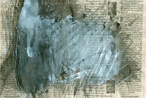
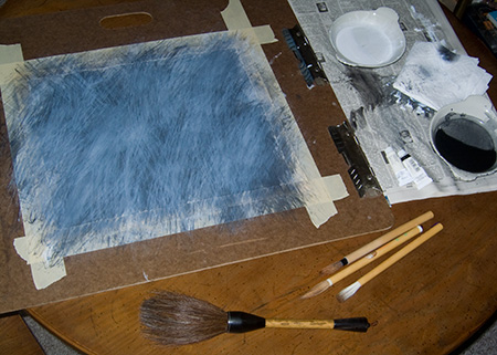
Test Sheet
Most painters have a little spot next to their artwork to smear paint around and test their brush before applying it directly to the artwork. Here is the newspaper I used in my current watercolor painting setup, you can click on the picture for a larger view.
I used to oil paint with my canvas attached to the wall, so I used to wipe my brush right on the wall next to the painting. Here’s a photo of what that looks like. It used to annoy me terribly when people would visit my studio and see my paintings in progress, they would be completely indifferent to my work, but they’d go up to the smears on the wall and say, “ooh, what is that?”
But lately I’ve begun to see what attracts people to these smears. It’s an accidental painting done with absolutely no painting intention. It’s just a test sheet to see how my brush is loaded and how dark and transparent the pigment is, it’s applied over previous test brushstrokes in roughly the same layering as my current painting. So it contains many of the same decisions I make in my current painting, but completely stripped of any deliberate brushwork or imagery. If you think about it, that’s quite Postmodernist (especially considering they just end up in the trash).
I remember seeing a video of Chinese students during the Tiananmen Square protests, painting banners with big brushes and sumi ink. They had a room full of big tables covered with fabric and large posterboards, and at the end of each table were sheets of newspapers, covered with black ink. Each sheet of paper was curled up like a little bowl. Sumi ink is thick and full of resin, so once the sheet was covered in ink and dried, it formed a waterproof bowl, and the students would fill them up with ink. I thought that was pretty clever, but I prefer using a ceramic dish.
Eye
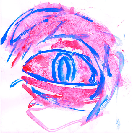
I went through some old work and I found a watercolor painting that was particularly amusing. I don’t remember painting this, but I must have done it around 1992. I remember I took a drawing class and was assigned to do endless studies of cranial anatomy and the eye in particular. It’s anatomically accurate enough that I can tell it’s my own right eye. I must have been bored with the assignment, staring at myself in the mirror, and decided to spice things up a little. You can’t tell from the scan, but the pigments are intensely bright Day-Glo fluorescent magenta and cyan. I wish you could see the original, it’s almost too bright to look at.
Painting
I’ve been painting a lot lately. It’s easy to set up a little watercolor painting area with just black and white pigments and a few brushes. Here’s a photo of my painting area.
This painting isn’t anywhere close to being finished, it has a long way to go. It’s actually quite a bit darker than this photo indicates. This is one reason why I don’t like to show my artwork on the internet, photos just don’t capture what the paintings look like. And that’s a deliberate choice. I work with a lot of chalky flat textures against shiny or matte black layers. Some layers are thin and transparent, and build up density slowly, some are opaque. It is almost impossible to see my paintings’ best effects without looking at the original surface. Photos just don’t work.
Lately I’ve been thinking about a quip by my favorite painter, Jean Dubuffet, he said, “the problem of painting is how to cover a surface in an interesting manner.” I think he was poking fun at painters when he said that. It’s easy to make an interesting surface, but what are you going to do with it? I never quite figure that out until I’m halfway through the painting. Sometimes I never figure it out.
One challenge I set for myself was to try to work watercolor media as hard as oil paints. It’s a lot easier to control transparent effects in oils, but water media tends to drag up the layer below it, if you paint white over black, you just get a murky, chalky grey. But I like those tones, so I paint layer after layer, building up tone slowly.
I like to tape my paper down to a board, since it buckles and swells when water hits it, but becomes taut and flat once it dries. It’s a lot easier to paint on the same paper over and over if it doesn’t buckle and warp. Then when you pull up the tape, the painting is framed with a nice clean white edge. A serious watercolorist would soak the paper and glue it down with paper tape while it’s still wet, then it would really be stretched flat. But that’s too much trouble and you have to cut the image out, leaving no margins around the image.
I also found my old “fudemaki,” that’s a Japanese “brush wrap.” It’s full of nice calligraphy brushes I bought in Japan a long time ago. Most of these brushes are so nice I have never used them, I was saving them for a special occasion. Then I figured, what the hell, I guess this is what I was saving them for. My particular favorite brush is the huge stubby brush at the bottom of the picture, I did most of this painting with this brush, using dry brush techniques. The brush is a little too large for a piece of paper this small, but I’ll make it work anyway.
I also have a bunch of cheap writing brushes, most of them have “300 Yen” tags, so I paid around $2.60. At the top of the group of 3 brushes in the picture is a crappy brush I bought locally at Dick Blick for over $6, it has half the hair and none of the great shape of the two 300Y brushes next to it. That crappy Dick Blick brush was what inspired me to go hunt for my best brushes, I knew I had lots of better brushes sitting in a box somewhere.
Also I found a cache of really good Holbein watercolors, some of the pigments I use in photographic printmaking. They’re really quite good. I used to make huge black and white paintings using cheap tempera paint, but this is much better.
So now that I’ve got my better materials all set up, I feel like I’m actually doing some good painting. I’m actually finding directions to go in each painting, and relatively quickly. One of my artist friends looked at my recent paintings, and encouraged me by telling me, ‘now you have to do a whole bunch more of them!” So I told him a story I heard about Jean-Michel Basquiat. When he was just starting to hit big, people were lining up to buy whole shows of his paintings, but he was still only working on one painting at a time, so his output was really low. His gallery wanted more paintings, more quickly, so they offered to send an assistant over to his studio to help him prepare canvases. Basquiat could spend more time painting and less time setting up. So the assistant comes over and finds Basquiat working on one painting. He sets up a few blank canvases and tells Basquiat he is ready to help shift canvases around when he’s ready to work on different paintings. But Basquiat never heard of this before, the assistant had to teach him that you could work on several paintings at once, switching between them, leaving some paintings to dry for later overpainting, coming back to them when your ideas have developed further. Suddenly Basquiat started really cranking out a lot of paintings. The gallery was very happy to have a vast supply of new works. Basquiat was raking in the dough, which only lead to his downfall.
Well when I first heard that story, I admit I was the same way. I usually worked only on one primary painting at once. So I tried working on several paintings simultaneously, it was surprisingly effective. I got a whole show of about a dozen paintings ready in just a couple of months. Of course I cranked out a lot more bad paintings too, but nobody has to see them.
So one of the reasons I post photos and other projects with my paintings, is to let people take a look at what is behind the easel. An art consultant once told me that people don’t want to buy your images, they also want to buy into your backstory as an artist. I may not have the same interesting backstory as a Basquiat, but we all, as painters, have to deal with some of the same issues.
Dutch Blue, Again
An old, obscure article I wrote on the subject of the pigment “Dutch Blue” and lapis lazuli has suddenly become relevant again, albeit in another obscure context. I discovered some discussion on the Ancient Japan Weblog about a frescoes in a tomb dated to the 7th or 8th Century. Researchers suddenly withdrew their assertion that the blue pigment in the tomb paintings were made from lapis lazuli. This retraction caused much puzzlement amongst scholars as no reason was given, and it appears that forensic analysis has not yet been performed. My article asserted that lapis was used as a pigment in the Edo era, but there is no evidence that it was used as early as the 7th or 8th century in Japan, so its use at such an early date would have been a significant historical discovery.
I won’t repost the entire obscure discussion, but I will point towards the original post at the Ancient Japan Weblog and the followup discussion on their associated forum.
“Los Angeles Center for Digital Art” Scam
If there is one thing that really burns me up, it’s fraud on the Internet. This fraud by Rex Bruce and his so-called “Los Angeles Center for Digital Art” is especially heinous, as it preys upon struggling artists who seek only to expose their artwork to the world.
Today I read an announcement of an “Open Show” of digital artworks at LACDA. An Open Show is an exhibition with no restrictions, anyone can exhibit their work if they pay the entrance fee. But this announcement (I refuse to post the link) is a money-making scam by Rex Bruce.
There are real Open Exhibitions, and the fraudlent LACDA gallery even had the nerve to compare itself to the famous LA Open Call:
Every year for 50 years the L.A. Municipal Gallery has held its “Open Call” exhibit where any artist can show up with their art and an entry fee (to benefit gallery programs) and the piece is shown. The Los Angeles Center For Digital Art decided to launch an international experiment of the same nature where the artists upload images that are printed and hung by the gallery.
Okay.. this LACDA show is “of the same nature” as the LA Open Show, but it is not the same. The LA Open is a benefit show for the Barnsdall Art Park, for a modest $20 you can submit a sculpture, photo, or painting up to 5 by 5 feet, and the first 1000 entries are guaranteed to be shown. A jury of local artists picks the 10 best works in the show, and awards them a $100 cash prize. Leftover proceeds from the entry fees are used to support public arts programs, for example, children’s classes at the Junior Arts Center.
But the LACDA scam is quite different. For a rather expensive $31.25, you can submit one jpeg image, which will be printed on letter-size paper and hung in the foyer of Rex Bruce’s loft for 3 weeks. The “gallery” is a single room in the decrepit center of Downtown LA’s Skid Row, even the Police are afraid to walk in that neighborhood. There are no prizes or awards given to exhibitors, and Rex Bruce will keep your work after the show.
There are pictures of last year’s show up on the LACDA website, I have joined them in a pseudo-panorama to show as much of the exhibition as possible, without any duplication or overlap. The original photographs were copyrighted by LACDA, but I am presenting this derivative composite image under the Fair Use laws, for purposes of journalistic documentation in the public interest.

I counted at least 250 images in this photo, and there are obviously more that extend beyond the edges of the picture. At $31.25 for each entry, that is a minimum of $7,800. The “gallery” is a single room, the image shows only one wall and a freestanding wall on the left that might have images on the other side, so it is possible this exhibit has 500 images, maybe more. That could be over $15,000 of profit! And Rex Bruce keeps all the money.
I decided to investigate Rex Bruce a little more, and unfortunately, this isn’t the worst of the scam. Rex Bruce operates two of these shows each year, one is a “juried show” where a panel selects the works suitable for exhibition. But you must still pay a $31.25 entry fee, even if your work is rejected. One prize is awarded at the juried show, inkjet prints listed as a $1500-2000 value, but that is retail price, the cost to produce the prints is less than $100. There are no obvious clues to how many works were submitted to the last juried show, but it is unlikely to be as high as the Open Show. Still, it is obvious that Rex Bruce is raising thousands of dollars every year by exploiting artists with entrance fees to his tiny one-room “gallery” near Skid Row. Rex Bruce is paying his rent by scamming hundreds of artists, one $31.25 fee at a time.
Oh but it gets even worse. Rex Bruce insists on a 50% gallery commission from any works sold from his show. This is a fairly standard cut for professional art galleries, but those galleries don’t just stick your tiny picture in a group show with hundreds of other artists. A professional gallery commits to actively promoting their selected artists, and they earn their 50% commission. Rex Bruce says that after the Open Show, he will put all the prints in a book that people can view at his gallery. That sort of passive promotion isn’t worth a 50% commission.
I would not get so enraged at this sort of scam if Rex Bruce didn’t go to so much trouble to represent himself as a prestigious art association. But if you do some research, he is an obvious fraud. The situation became clear when I saw who was the first artist to exhibit work in Rex Bruce’s gallery: Rex Bruce. This is known in the art world as a “vanity show,” where artists pay to exhibit their own work. Rex Bruce created his gallery to promote himself. And he continues to produce vanity shows, but now he’s profiting from other artists who pay to show their works. He exploits artists for his own profit, and he’s laughing all the way to the bank.
Nam June Paik R.I.P.
I was extremely saddened to learn that the renown video artist Nam June Paik has died. Paik had been extremely sick for the past few years, so this was not unexpected, but I am shocked just the same. As I thought back about Paik and his groundbreaking work as “The Father of Video Art,” I became aware that as an artist’s role model, he had more impact on me than I ever realized.
I had the pleasure to study briefly with Nam June Paik, back when I was a lowly freshman in art school around 1975, and he came to teach as a visiting artist. I still vividly remember him and his strange lectures to the assembled students, as we sat on the grimy floor in the art school’s video studio. Paik had almost singlehandedly invented what was known back then as the “Video Synthesizer.” Today we would probably call it computer graphics, but back in the early 1960s, no computer was fast enough to produce elaborate video graphics, it had to be done with analog circuits. Everyone considered his invention as akin to wizardry, and the students all wanted to know how he invented it. Paik described, in almost incomprehensible English, how he just tore TV sets apart and started playing audio tones from tape recorders and music synthesizers into the TV circuits. He said he played around and fiddled and through trial and error, finally figured out how to control the deflection and color of the TV signal directly, turning the TV into an electronic sculpture. Nobody had ever thought to do such a crazy thing before. Eventually he figured out how it all worked and what he wanted to do, so he had analog circuitry manufactured to his specifications, and the Video Synthesizer, the visual equivalent of the music synthesizer, was born. Now we could perform on a TV like musicians playing an instrument.
But Paik had been invited to our art school not just for his innovations in Video Art, but because he was a performance artist in the Fluxus movement. Paik was notorious for his scandalous performances featuring nudity (like “TV Bra“) or sheer mayhem with smashing TV sets and burning grand pianos. Nothing I say could possibly do justice to his work, or the mountains of critical analysis of his career. But I will always remember him as the jovial guy who taught a lesson that I will never forget.
While the assembled students were peppering Paik with questions about how his incomprehensible invention worked, he changed the subject radically. With a waggish smile, he said he would tell us a secret. He had discovered the most powerful artist’s tool in the history of mankind, the Manhattan Yellow Pages. He said that the Yellow Pages was full of businesses that employed experts in the most obscure subjects, all you had to do was phone them and ask about something, and they would tell you anything you wanted to know. Even today, 30 years later, I still think this captures Paik’s genius, he taught me that Art is not an act of creation, anybody can create something, there is nothing particularly original about that. To the contrary, Art is an act of invention and we can innovate only by building on the works of others.
Paik’s most famous artwork is certainly “TV Flag,” which is as much a sculpture made of TV sets as it is a set of video synthesizer recordings that play on those TVs. Here is a later edition of “TV Flag” produced in the 1990s, currently on display at the Hirshorn Gallery.
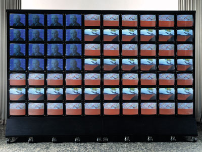
The Hirshorn web page describes the work, “…stars and stripes share air time with split-second news stills, rotating statues of Liberty, endless runs of ones and zeros (the binary language of computers), and a face that morphs through every U.S. president from Harry S. Truman to Bill Clinton. Paik’s video is his paean to America and the power of learning from a youth oriented culture.” But this is not the original TV Flag that Paik created in 1968 at the peak of the Vietnam War. That version is owned by the Los Angeles County Museum of Art, and I used to go to see it over and over. That version is full of images of jets and helicopters, guns and explosions, Vietnam war footage, and it is a bitter indictment of American imperialism filtered through the medium of Television. This was not “Medium Cool” of the “Television War” that Walter Cronkite beamed into our homes every night on our cold cathode ray tubes, this was a hot, angry blast of thousands of flash-cut images that washed over your subconscious faster than they could be recognized. It leaves the viewer with no clear memory of any specific visual images, just a vague, bitter aftertaste. It was the vision of America as it fought a war in Asia, produced by an expatriate Asian.
As I researched this article, I discovered, to my dismay, that Paik’s seminal TV Flag artwork has died of old age, the TV sets have burned out and cannot be repaired, and the work has been disconnected and sits idle, the TV sets blank. This is unbearable news, almost as bad as Paik’s death.
The loss of TV Flag’s video equipment is tragic, the artwork depends on the physicality of the large CRTs, but the artwork could be renewed. I remember what Paik said during his lectures at my art school, he asserted that each replay of a video artwork was a unique original performance, just like every other time it was replayed. Back then, most video art was produced on videotape, Paik was almost unique in that he produced sculptures made from TV sets. But I am sure that Paik did not care what type of TV sets displayed this work, the TV sets could easily be replaced and the work could live again. But it would have to be done immediately. TV Flag may ultimately be doomed, it is the wrong format for the new High Definition TV sets. The video recordings could be transcribed into another format, but soon there will no longer be any cathode ray tube TV sets that can play this work. Surely TV Flag will live on, preserved for the future in a transcribed version. But we are the only generation that will be able to appreciate the full impact of the work both as an original sculpture and a video performance, and even further, as a sociological statement on that moment in our lives. Ironically, by creating a sculpture that incorporates an electronic recording that can be played over and over, Nam June Paik created an ephemeral work that, in its original form, will barely outlive him.